Colours
For generations, Blue has been the No. 1 writing colour in Germany. This is reflected in Schneider’s colour world, with a palette of striking shades of blue that can be used both as solid fills and gradients.
Primary colours
Here is an overview of Schneider’s company colours. Heritage Blue has a long-standing tradition in our company’s history and shapes the brand identity across all communication channels. The vibrant Make it Blue is specially designed for digital use. Radiant highlights are set with Matter Blue. The correct colour values for the different output media can be found in the following colour value table:

Heritage Blue
CMYK: 100 | 20 | 0 | 83
RGB: 0 | 39 | 65
HEX: #002741
Pantone: 303 C

Make it Blue
CMYK: 100 | 60 | 0 | 0
RGB: 15 | 30 | 200
HEX: #0F1EC8
Pantone: 2728 C

Matter Blue
CMYK: 55 | 0 | 5 | 0
RGB: 55 | 215 | 255
HEX: #37D7FF
Pantone: 2985 C
Secondary colours
Sometimes it takes a strong accent to draw attention to a detail. A bright yellow is available as a secondary colour, which you can use as an eye-catcher. Our luminous green is reserved exclusively for product icons that highlight sustainable properties. Backgrounds can be designed using the subtle shades of Light Grey and Medium Grey.

Yellow
CMYK: 0 | 0 | 100 | 0
RGB: 235 | 237 | 0
HEX: #FFED00

Green
CMYK: 50 | 0 | 100 | 0
RGB: 145 | 205 | 60
HEX: #91CD3C

Light Grey
CMYK: 7 | 4 | 4 | 0
RGB: 242 | 242 | 243
HEX: #F2F2F3

Medium Grey
CMYK: 5 | 0 | 0 | 15
RGB: 218 | 223 | 226
HEX: #DADEE1
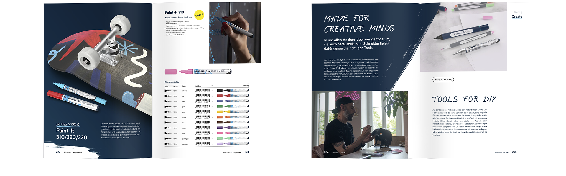
Schneider Create
Here, strong, solid colour areas in Heritage Blue and White dominate. The ratio of the two colours can be freely decided during the design process.
Schneider Promote
In the Schneider Promote product range, two types of gradients are used: Ambient Gradient, which provides a versatile stage for text, products, and more, Product Gradient, which skilfully showcases our writing instruments.
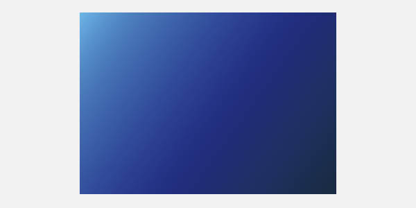
Ambient Gradient
The Ambient Gradient transitions from light to dark, always flowing from left to right. The light beam can be positioned either at the top or the bottom, giving backgrounds a sense of depth and structure.
Product Gradient
Our writing instruments are the undisputed highlights. We emphasise this with a special stylistic element: the Product Gradient, where an additional light source is placed behind the product. But pay attention! This background style is only used for single product displays.