Guides
Online Ads
Write & Mark / Highlight
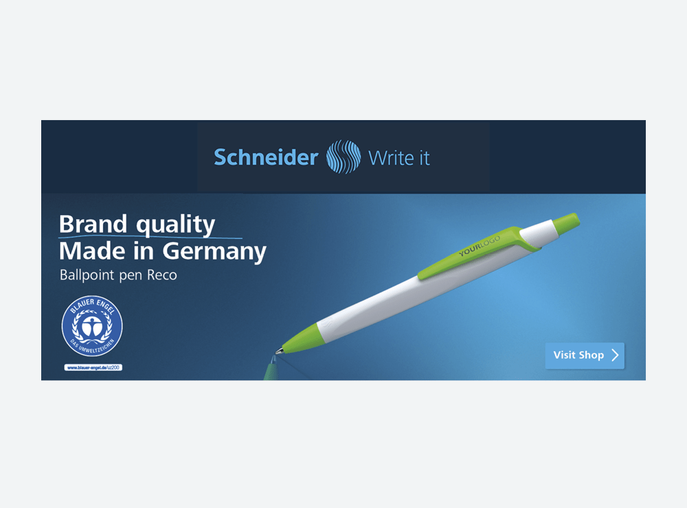
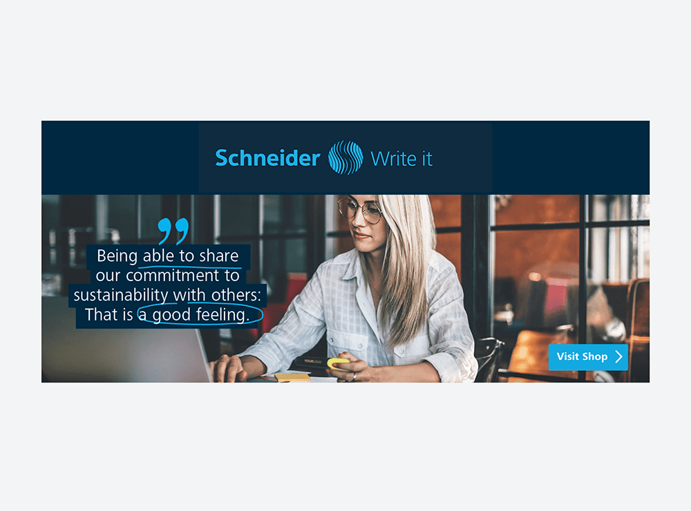
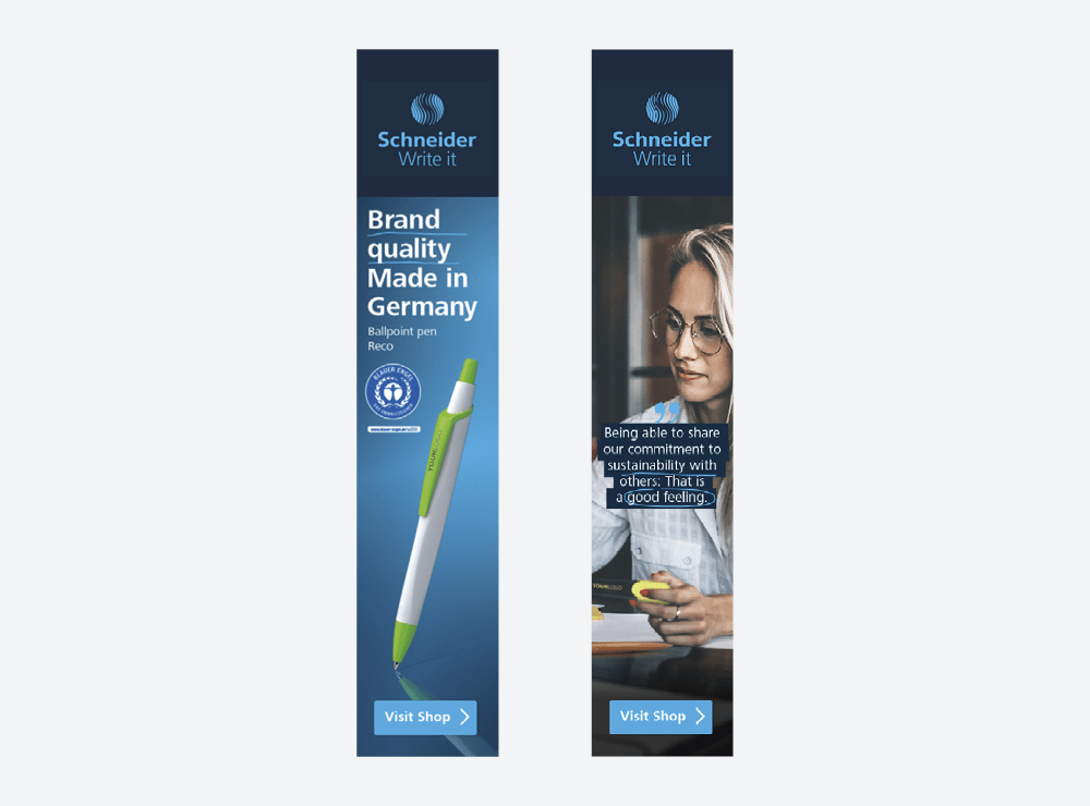
More visibility, more traffic, more performance: Here you can find out how to create effective online advertisements that correspond to our corporate design.
Overview
Online ads can be used for a wide variety of purposes. We use them to promote selected products, draw attention to special discount promotions or use them to pay tribute to our image. Regardless of the purpose of the online ads, they are always united by a uniform look.

Reduction to the essentials: This is the only way banners communicate quickly and clearly.
Layout
The principle also applies to online ads: First define the purpose, get to the heart of the message and combine the necessary elements. Some elements are obligatory, others can be used optionally.
Theme
At the beginning it is important to clarify whether it is to be an image, a product or a discount advertisement.
2Image
Choose a suitable application image for your topic that shows a writing instrument.
3Headline
Product-, image advertisement or discount promotion: Formulate a concise headline that corresponds to the communication goal.
4Call-to-Action
Make a clear call to action.
5Brand Banderole
The brand banderole is part of all online ads. Usually it sits at the top, but depending on the format it can also be placed on the right or left.
6Icons and Certificates
Icons or certificates can be added as an option. But attention, please: The ad must not look overloaded.
7Disruptors
Special information such as discount codes, promotional periods, etc. can be highlighted in disruptors.

Theme
At the beginning it is important to clarify whether it is to be an image, a product or a discount advertisement.
Image
Choose a suitable application image for your topic that shows a writing instrument.
Headline
Product-, image advertisement or discount promotion: Formulate a concise headline that corresponds to the communication goal.
Call-to-Action
Make a clear call to action.
Brand Banderole
The brand banderole is part of all online ads. Usually it sits at the top, but depending on the format it can also be placed on the right or left.
Icons and Certificates
Icons or certificates can be added as an option. But attention, please: The ad must not look overloaded.
Disruptors
Special information such as discount codes, promotional periods, etc. can be highlighted in disruptors.
Legende
- Verpflichtende Punkte
- Optionale Punkte
Examples for formats
What does the implementation of online ads look like in practice? You can see this in the following example formats. From very narrow to very wide formats, various design options are open to you to layout CI-compliant online banners.
Don’ts
The format of online advertisements is often not large, but it still has enough room for unfavourable design. Examples of situations you should avoid can be found here:

Makers Line
The Makers Line online ads focus on the most important things in the smallest format.
Layout
The online advertisements of the Makers Line are basically structured according to the same design principle as for the “Write & Mark/Highlight” product segment. Here you can see which elements you need for a CI-compliant online ad:
Theme
Define the communication target at the beginning: Which product do you want to promote? What message do you want to convey?
2Image
Choose a suitable application image for your topic that shows a writing instrument.
3Headline
Formulate a concise headline that corresponds to the communication goal.
4Call-to-Action
Make a clear call to action.
5Brand Banderole
The brand banderole is part of all online ads. Usually it sits at the top, but depending on the format it can also be placed on the right or left.
6Icons and Certificates
Icons or certificates can be added as an option. But attention, please: The ad must not look overloaded.

Theme
Define the communication target at the beginning: Which product do you want to promote? What message do you want to convey?
Image
Choose a suitable application image for your topic that shows a writing instrument.
Headline
Formulate a concise headline that corresponds to the communication goal.
Call-to-Action
Make a clear call to action.
Brand Banderole
The brand banderole is part of all online ads. Usually it sits at the top, but depending on the format it can also be placed on the right or left.
Icons and Certificates
Icons or certificates can be added as an option. But attention, please: The ad must not look overloaded.
Legende
- Verpflichtende Punkte
- Optionale Punkte
Examples for formats
Super high, super wide, super narrow, super good! The implementation of online advertisements offers many flexible design options in a wide variety of formats.

Promotional pens
Basically, the product area follows the design guidelines of “Write & Mark/Highlight”. Yet, there is one special feature: online advertisements are usually animated here. Are animations or a sequence of several images technically not possible? No problem. Then simply follow the guidelines for the online ads of “Write & Mark/Highlight” above.
Animated Storytelling
The product segment promotional writing instruments follows a two-stage approach for online ads: First, a product image is displayed, followed by a story linked to the product. To enable this process, online ads are animated.
Layout
In the online ads for promotional writing instruments, the product USP is also the starting point for the creation. An entire story can then be told via the animation. You can see which design elements you need for your work here in the overview:
Product
Focus on one product: What makes it stand out? Present the USP in a suitable story.
2Product Illustration
Present the product in the usual promotional writing pen look. This motif is shown first.
3Headline
Formulate a clear and striking statement.
4Call-to-Action
Make a clear call to action. This CTA remains unchanged throughout the entire animation.
5Brand Banderole
The brand banderole is a fixed component of the online ad that remains in place during the animation.
6Icons and Certificates
Icons or certificates can be added as an option. But attention, please: The ad must not look overloaded.
7Story Motif
True to life & Authentic: The second frame of the animation communicates the story through a powerful image.
8Quote
Sympathetic & concise: In a short statement, the content of the story is brought to the point.
9Disruptors
Special information such as discount codes, promotional periods, etc. can be highlighted in disruptors.

Product
Focus on one product: What makes it stand out? Present the USP in a suitable story.
Product Illustration
Present the product in the usual promotional writing pen look. This motif is shown first.
Headline
Formulate a clear and striking statement.
Call-to-Action
Make a clear call to action. This CTA remains unchanged throughout the entire animation.
Brand Banderole
The brand banderole is a fixed component of the online ad that remains in place during the animation.
Icons and Certificates
Icons or certificates can be added as an option. But attention, please: The ad must not look overloaded.
Story Motif
True to life & Authentic: The second frame of the animation communicates the story through a powerful image.
Quote
Sympathetic & concise: In a short statement, the content of the story is brought to the point.
Disruptors
Special information such as discount codes, promotional periods, etc. can be highlighted in disruptors.
Legende
- Verpflichtende Punkte
- Optionale Punkte
Downloads
We have prepared sample files as InDesign documents for you. They already contain all the important design elements and paragraph formats in common banner sizes.


