Layout
We tell relevant stories through words and images. This guide will show you how to develop exciting layouts from individual components.
Flexible design principle
Whether it’s a product catalogue, social media post or PPT presentation, our design principle is so flexible that it works regardless of the communication channel or medium. Concise graphic elements, expressive images and a clear typography ensure a high recognition value. Plenty of white space and a focused, uncluttered design lend the layouts a sense of lightness and modernity.
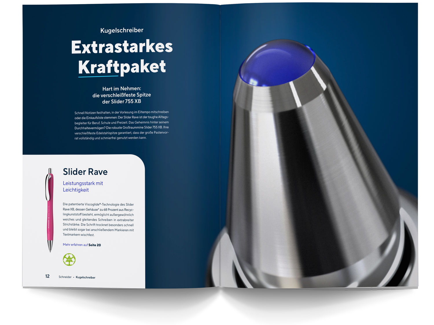
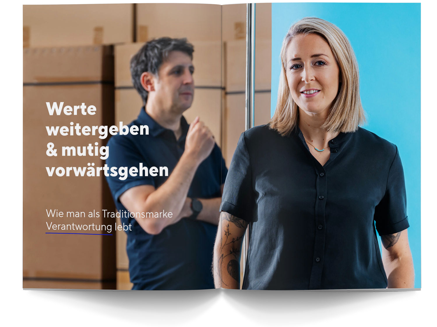
Expressivenes: our images
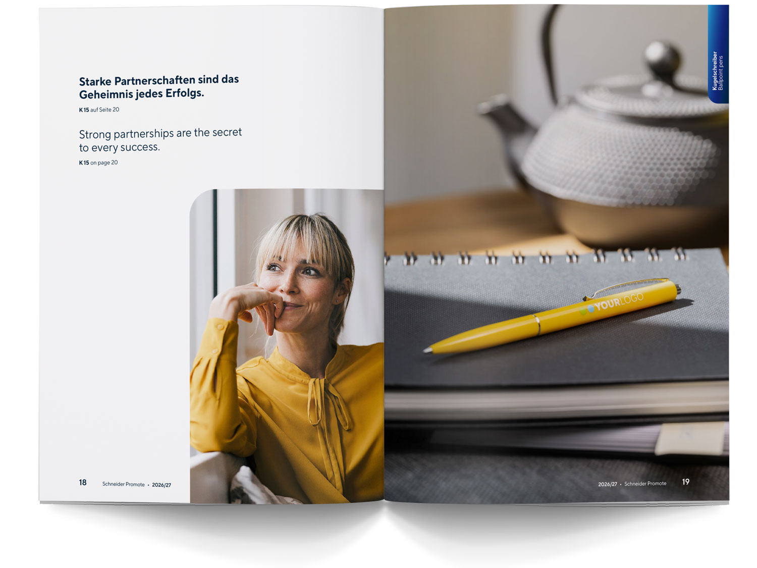
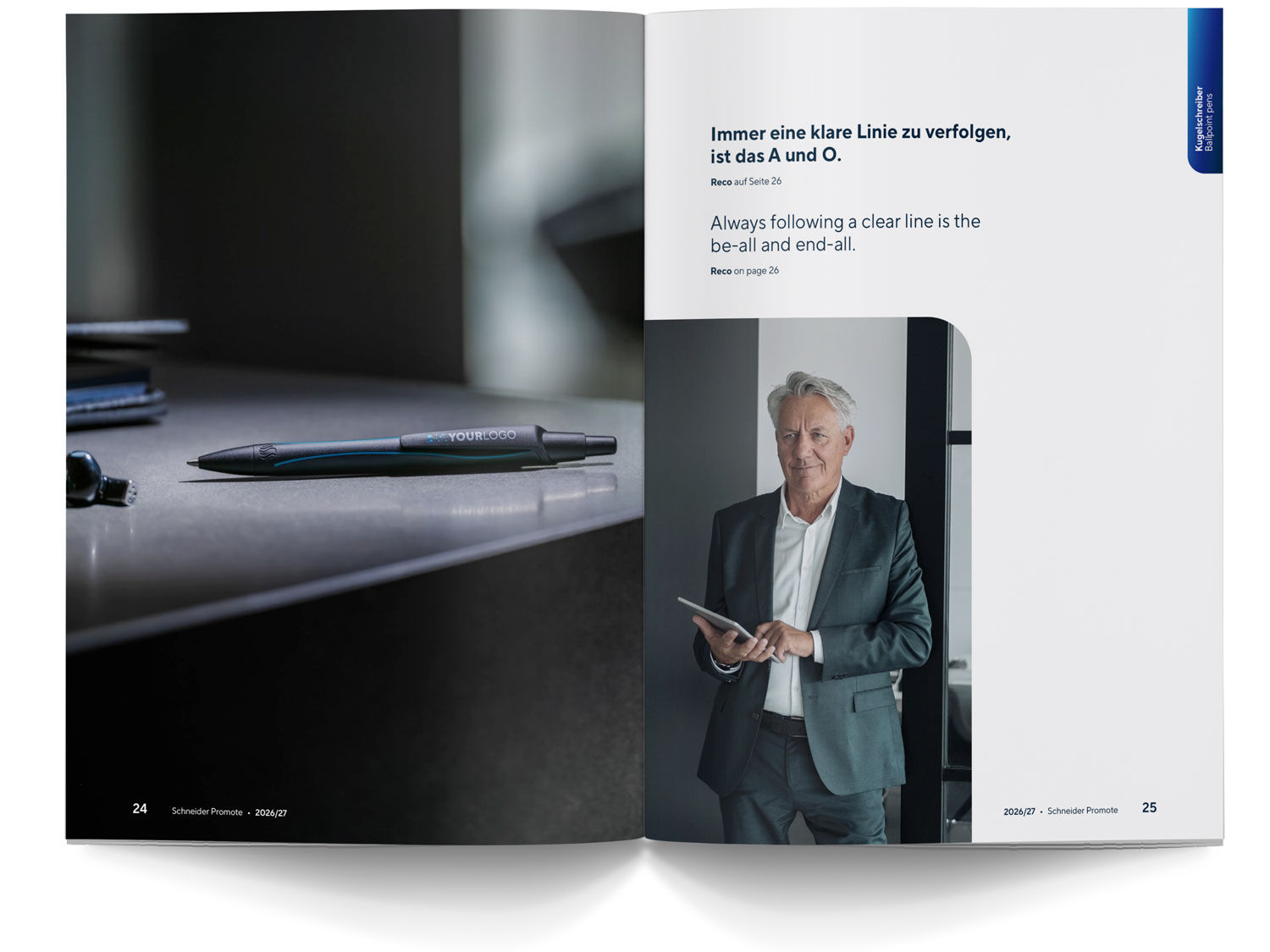
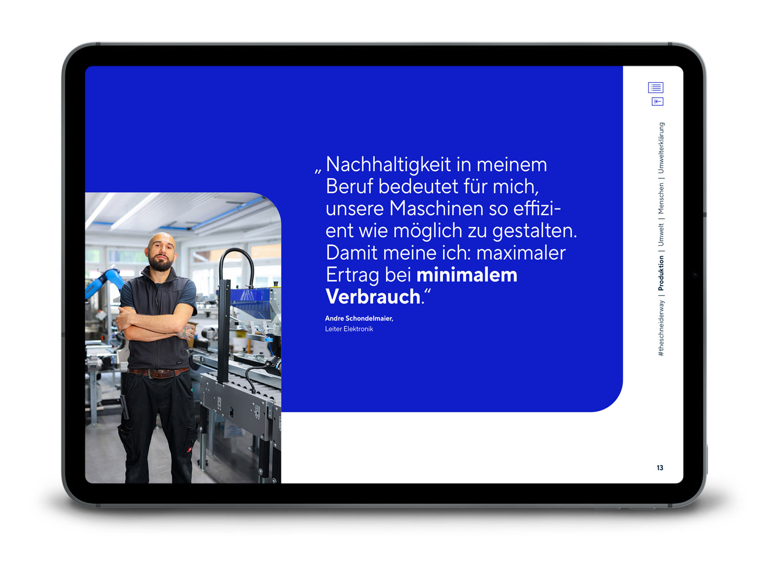
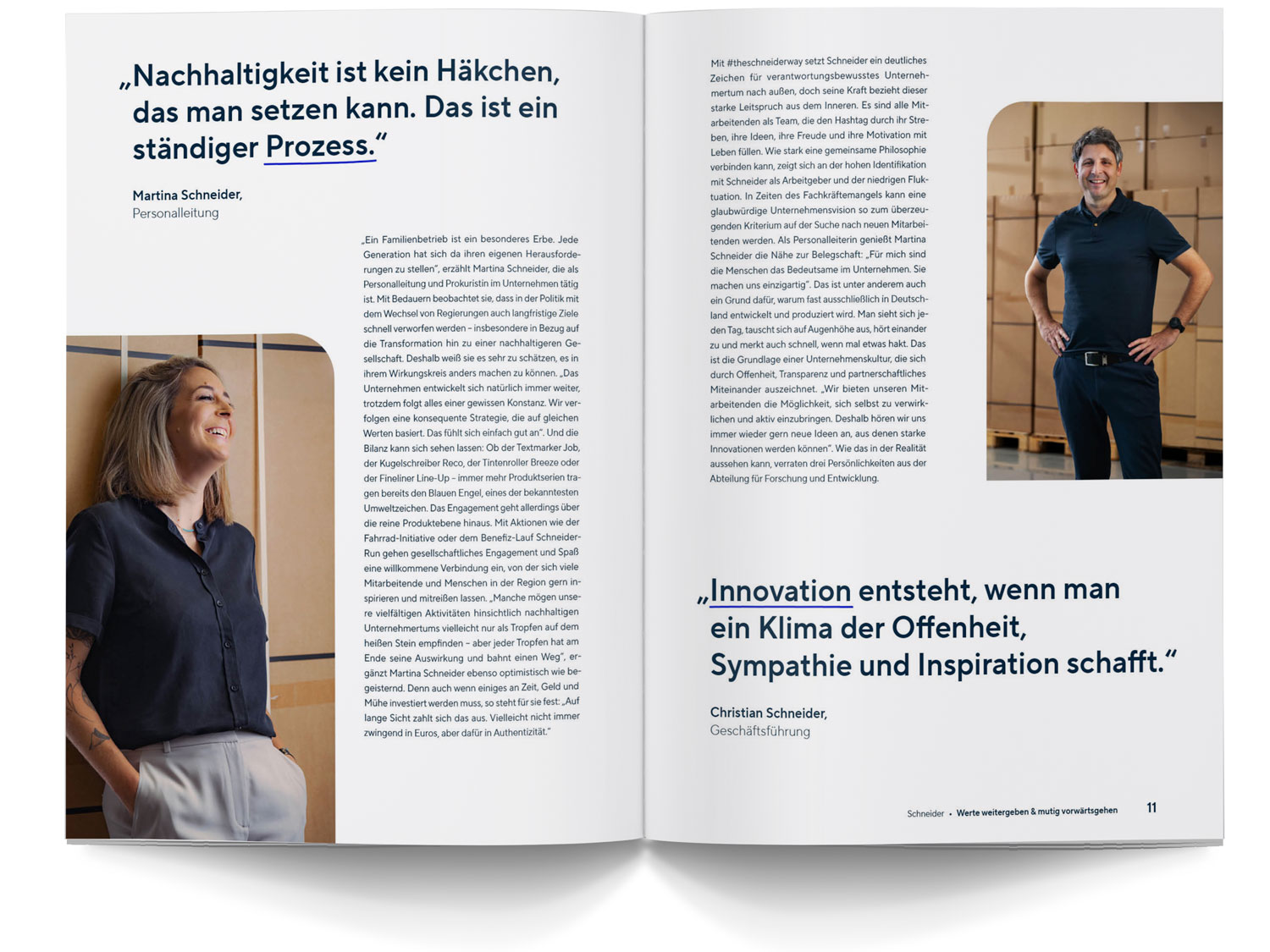
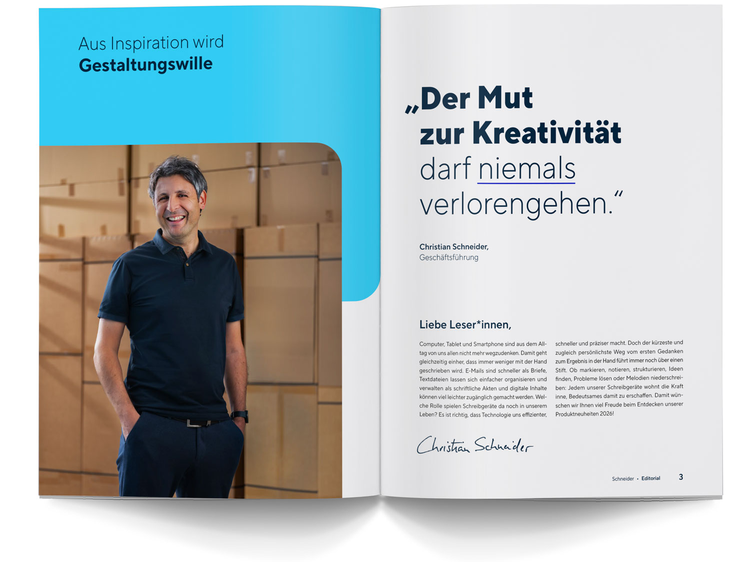
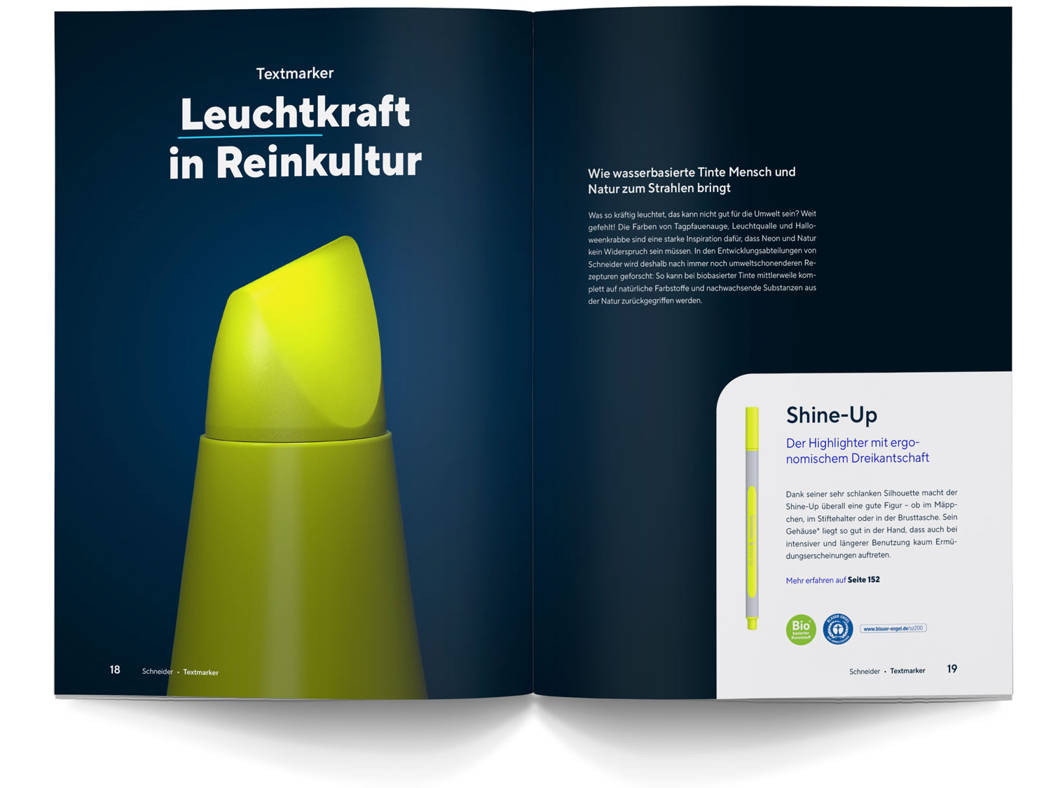
Always give images enough space to make an impact. If you combine several motifs within a layout, make sure that they harmonise well in terms of colour and content. You can find important rules and helpful tips on the subject of our visual world in the relevant section in the Brand Portal.
Uniqueness: the Circle Cut
The Circle Cut adds something special to layouts and supports the visual uniqueness of our brand identity. The rounded corner can be used for both colour surfaces and images. In the section on Graphic Elements, you will learn how to construct and use the Circle Cut correctly.
Clarity: our Typeface
Clarity and readability are always top priorities when it comes to layout. Various font styles of the corporate typeface TT Norms Pro Compact are available for design purposes. Use the different styles to create dynamic layouts. In publications, continuous text is primarily set in justified alignment in Regular. If publications are bilingual, the Regular and Light styles are used for continuous text. In the Typeface section, you will find important guidelines on the correct use of fonts.
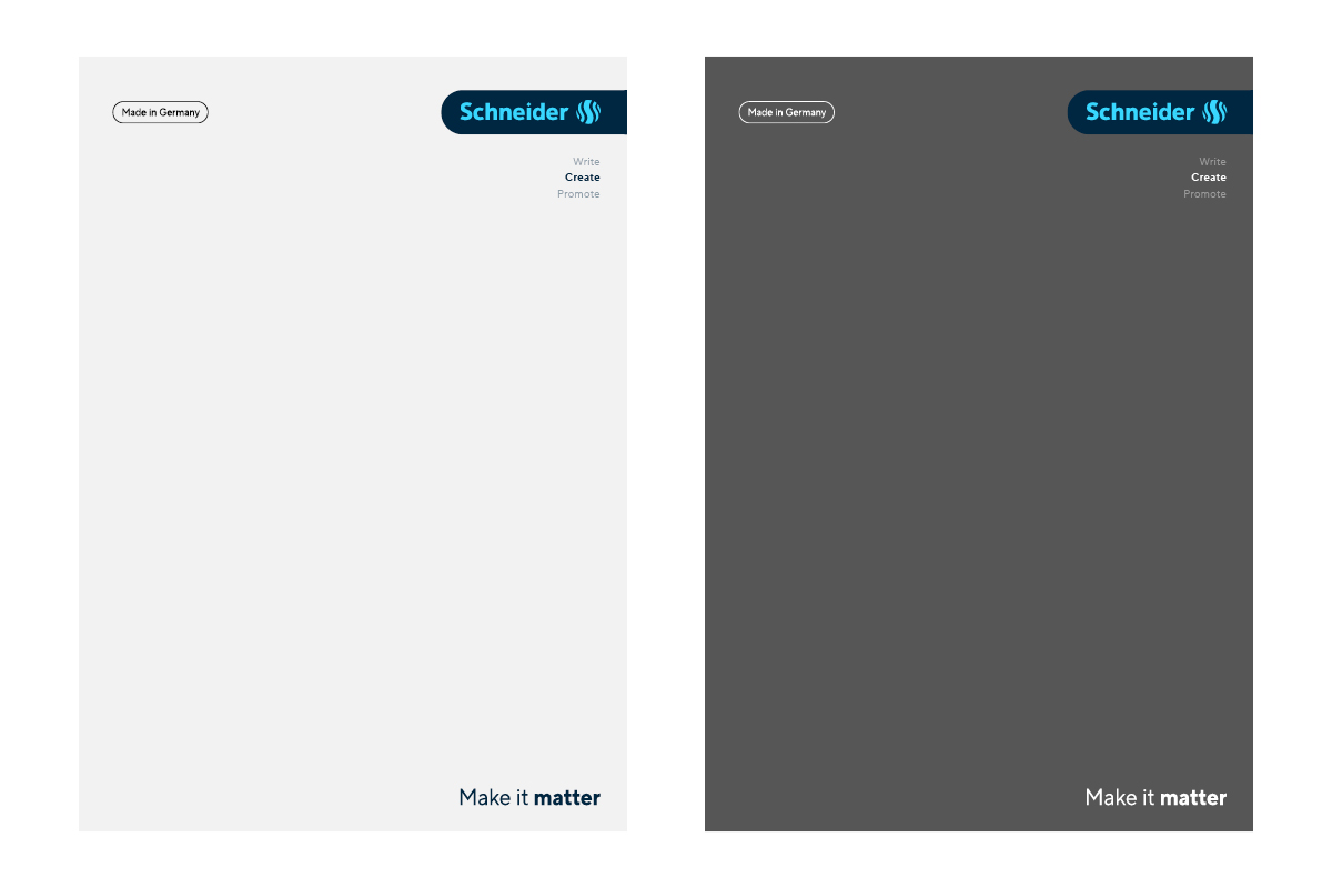
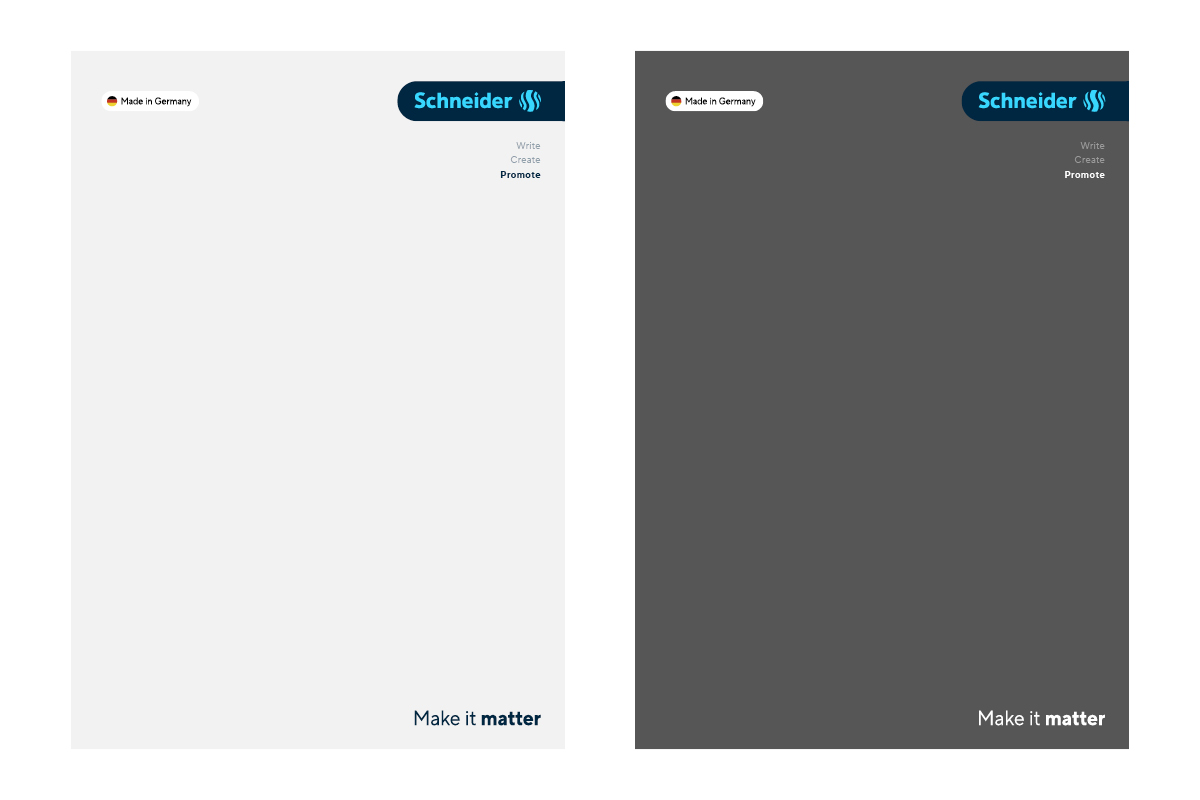
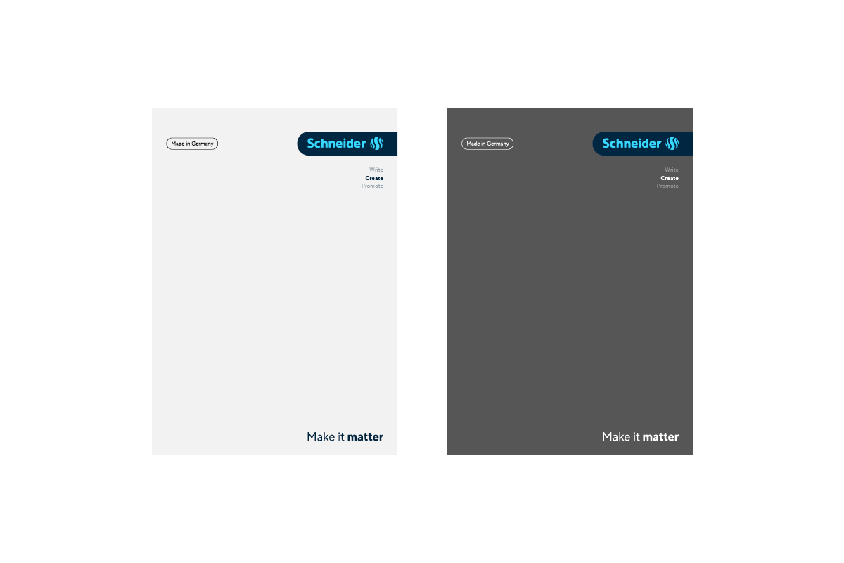
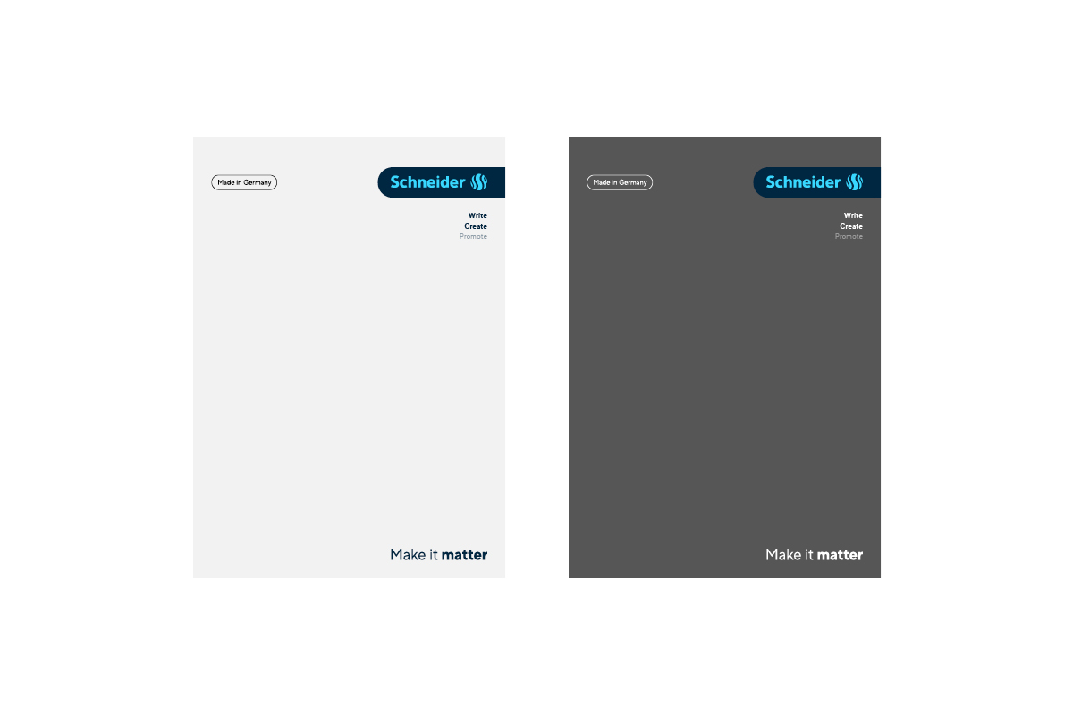
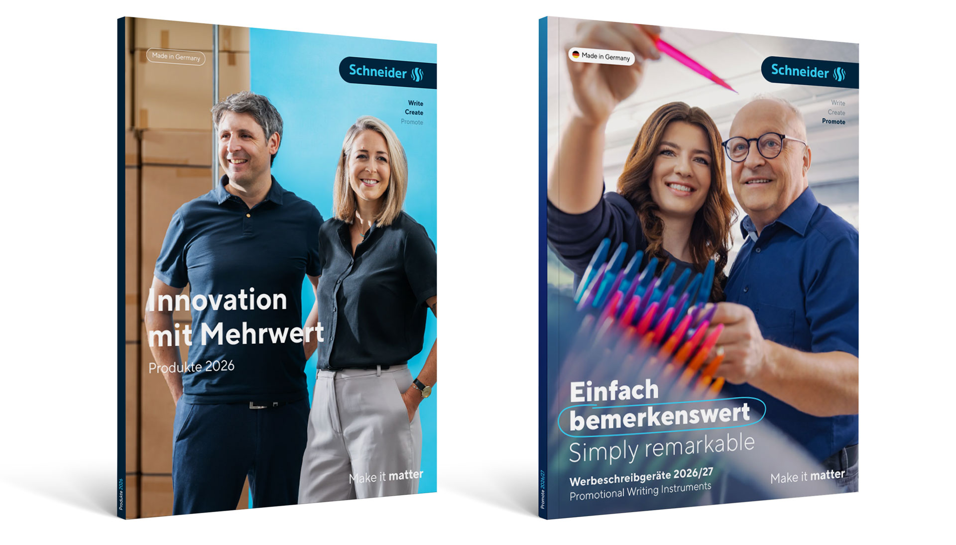
Cover
The cover is the first point of contact readers have with a publication. An expressive design immediately attracts attention and arouses interest. You can achieve this with striking images or exciting product presentations. Our branding elements create a uniform framework: these include the Logo Badge, the Made in Germany signet and our claim. In the Download area, you will find CI-compliant sample files that can be used to get started right away.
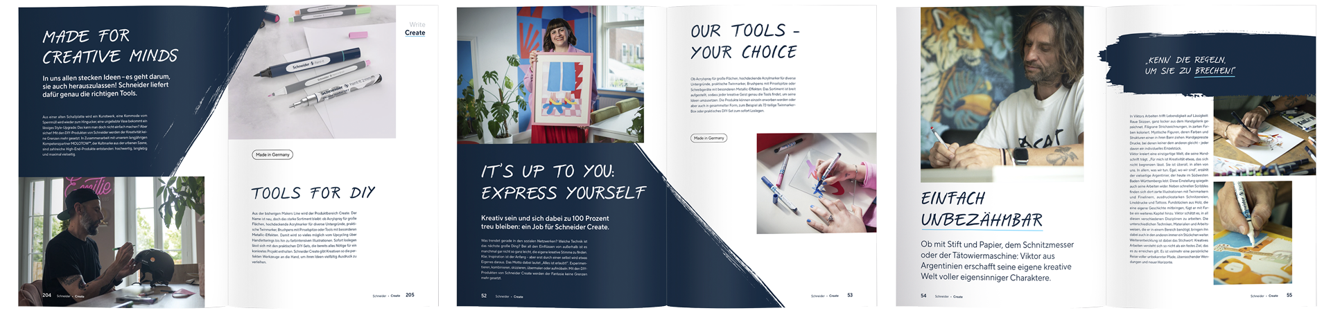
Schneider Create
The Schneider Create product range stands out with its rougher, more powerful look. It is strongly influenced by the Makers Line Regular, which is used for headlines and quotations. Another striking design element is the Create Brushes, which can be placed over large areas or as small individual elements.