Guides
Layout
Write & Mark / Highlight
We tell stories – in words and in images. In this guide you will learn how to develop exciting layouts from the individual components.
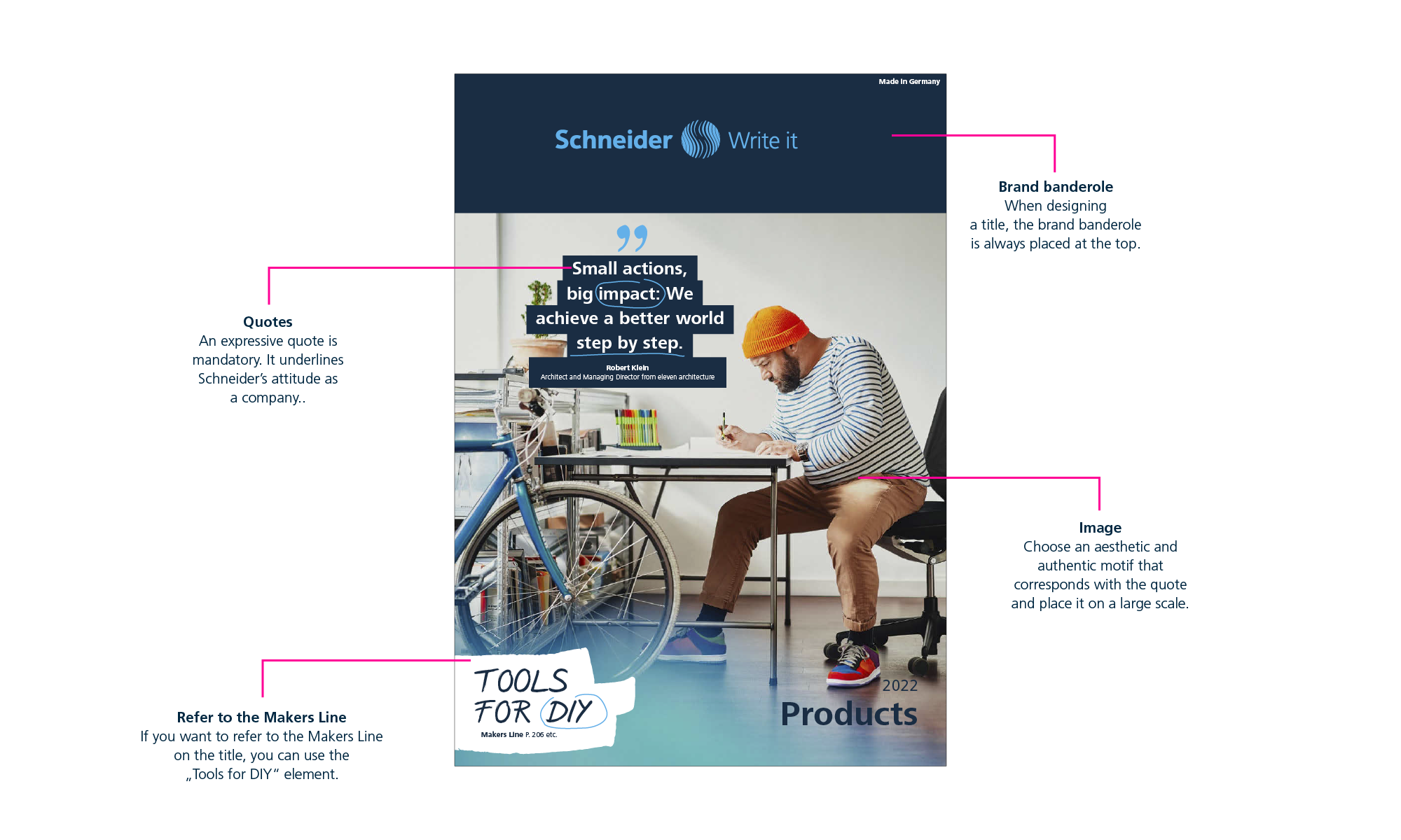
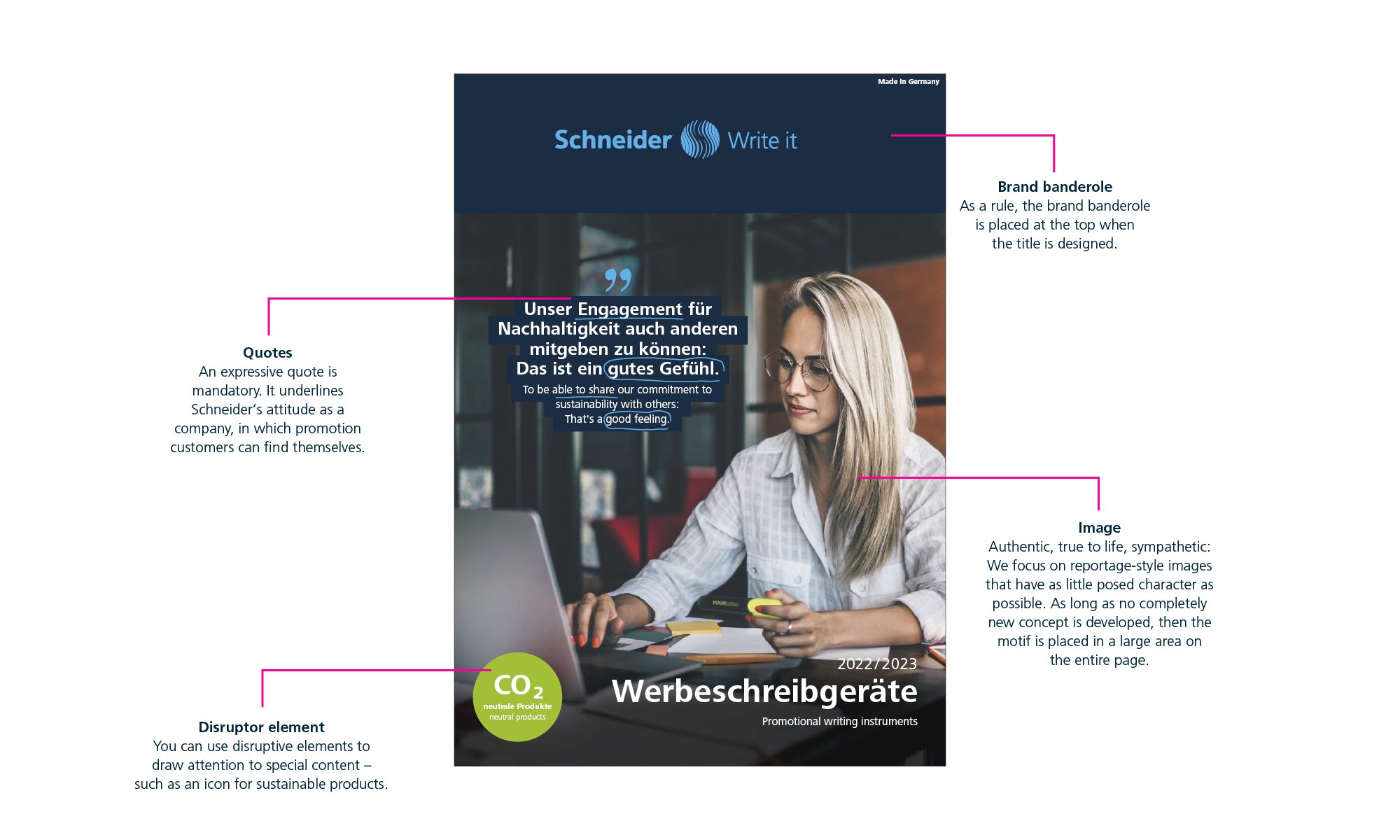
It starts with this: the cover
It has to be convincing at first glance: the title of catalogues, brochures and leaflets should invite readers to discover more. We show you which elements you can use to arouse their curiosity.
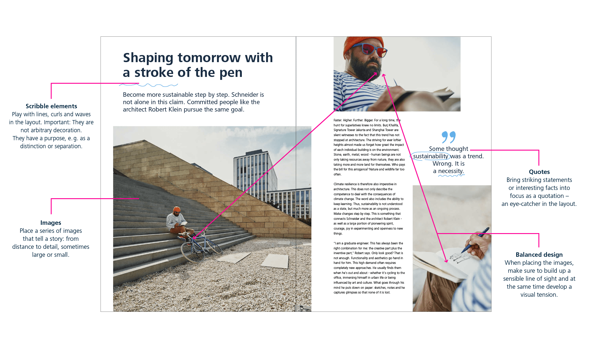
Tell a story
You can use different design tools to guide readers through a story: Attract their attention with a prominent headline, give them a taste in the teaser, open up a world with images. The important thing is to stay relaxed! Don’t fill the pages too much and leave white space. Quotes or scribble elements provide additional visual variety.
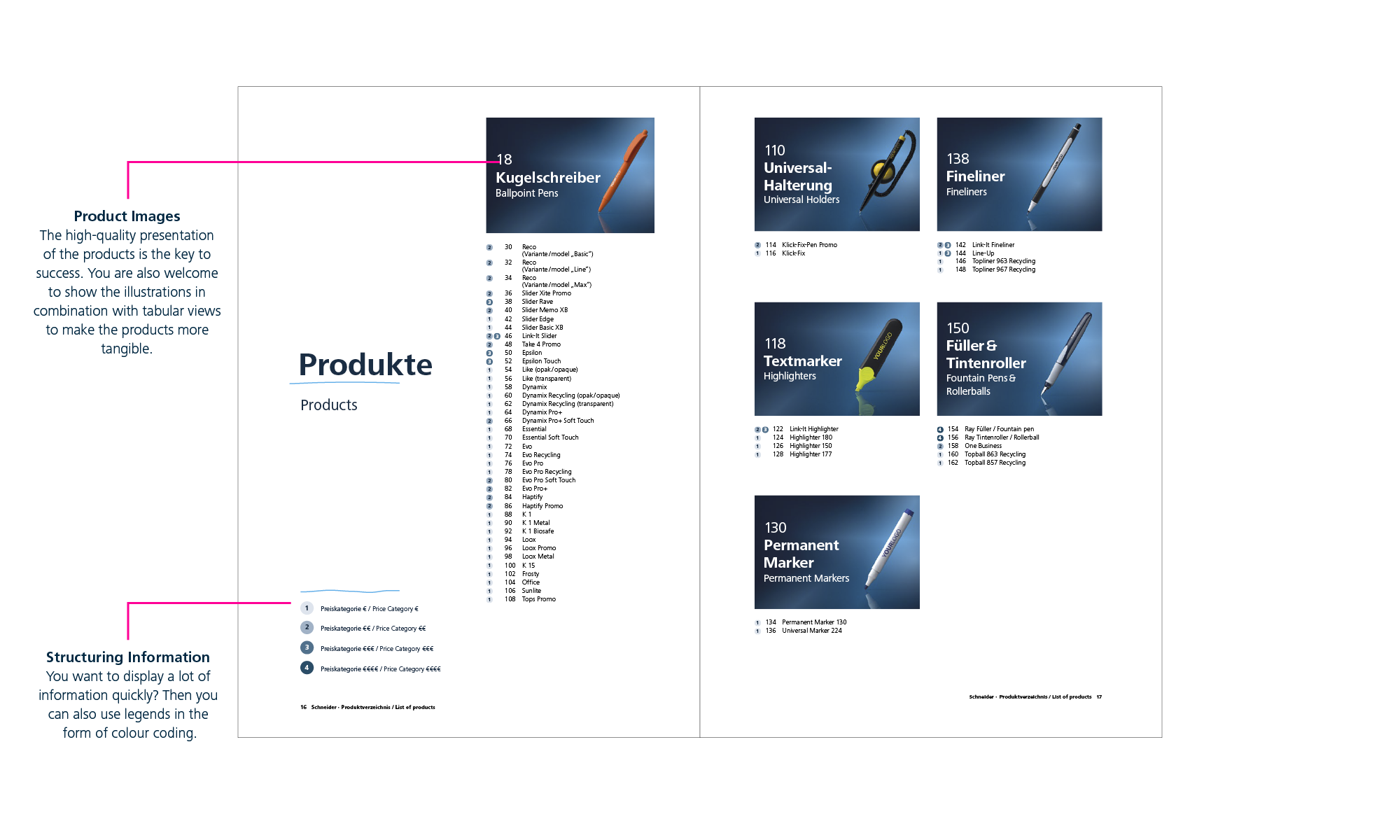
Present information
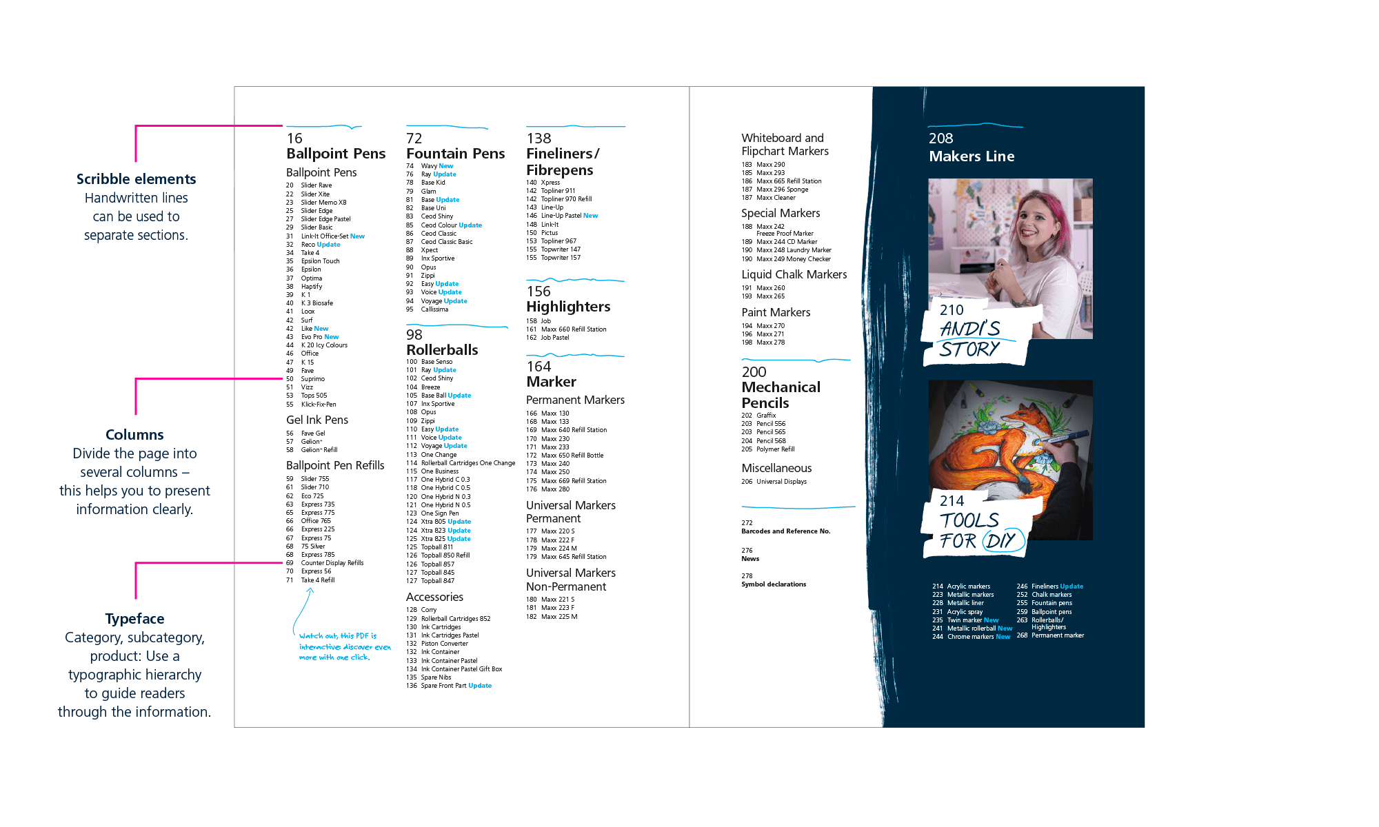
If you need to show a lot of content or complex information in a small space, choose a tabular view. It is structured, clear and easy to grasp – this increases reading comfort.
Chapter Divider
In multi-page publications it may be useful to separate chapters from each other. Here, too, we work with storytelling, which uses quotes and images to tell an authentic story about the chapter that follows.
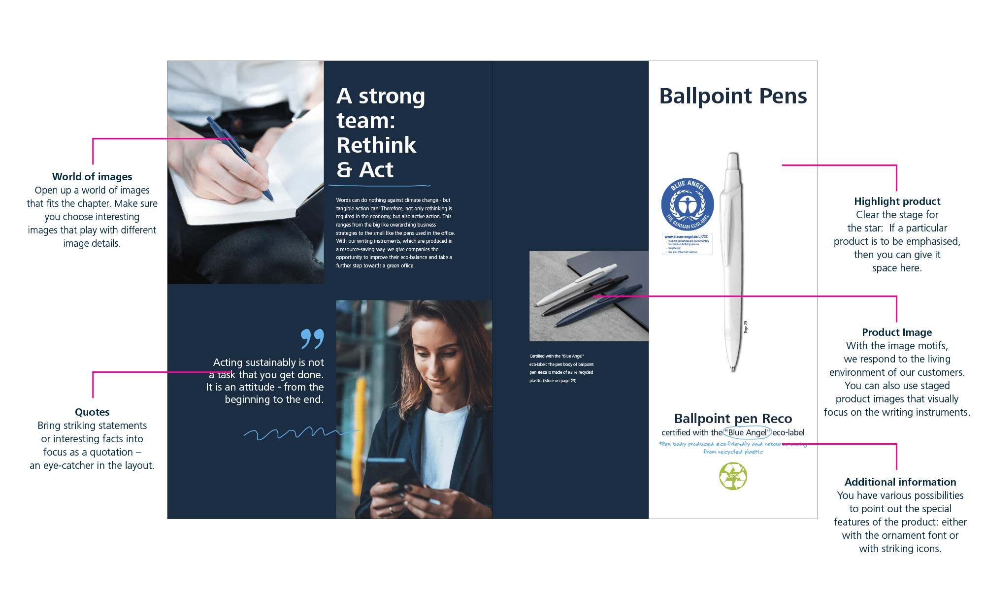
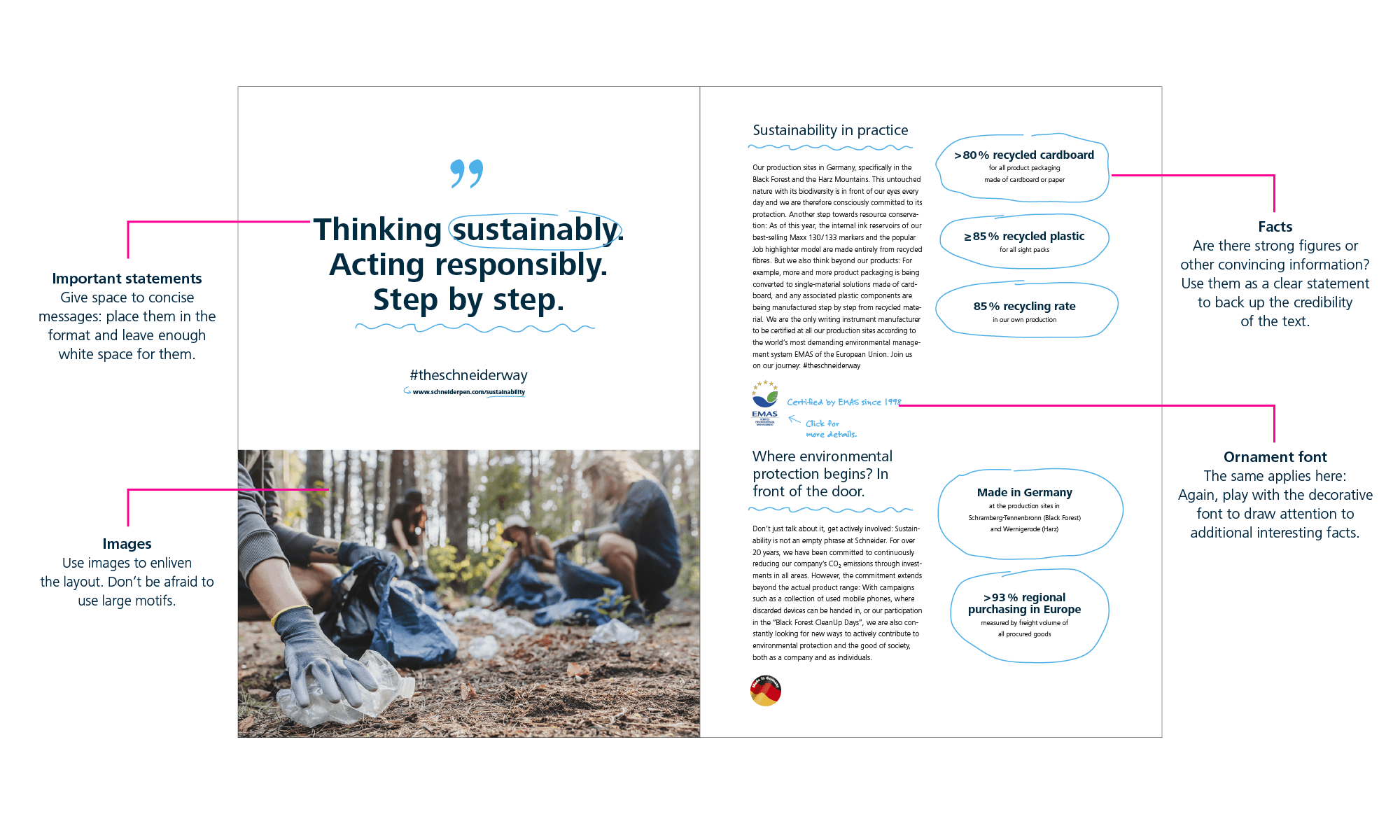
Balanced design
When you design a layout, you often have to deal with very different elements. The following double-page shows how you can combine quotes, facts, images and text in a balanced and harmonious way.
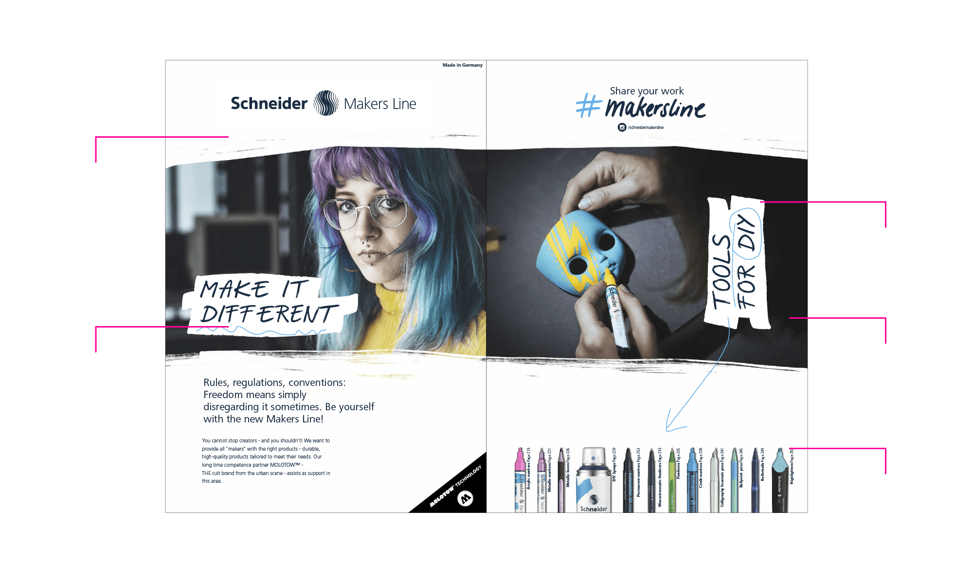
Makers Line
Unconventional, courageous and individual: The layouts are as strong in character as the Makers Line itself. The expressive application images are a special highlight.
Makers Line look
Brushes, big quotes, cool application images: Certain elements give the Makers Line its special look. Here we show you which ones belong to it.
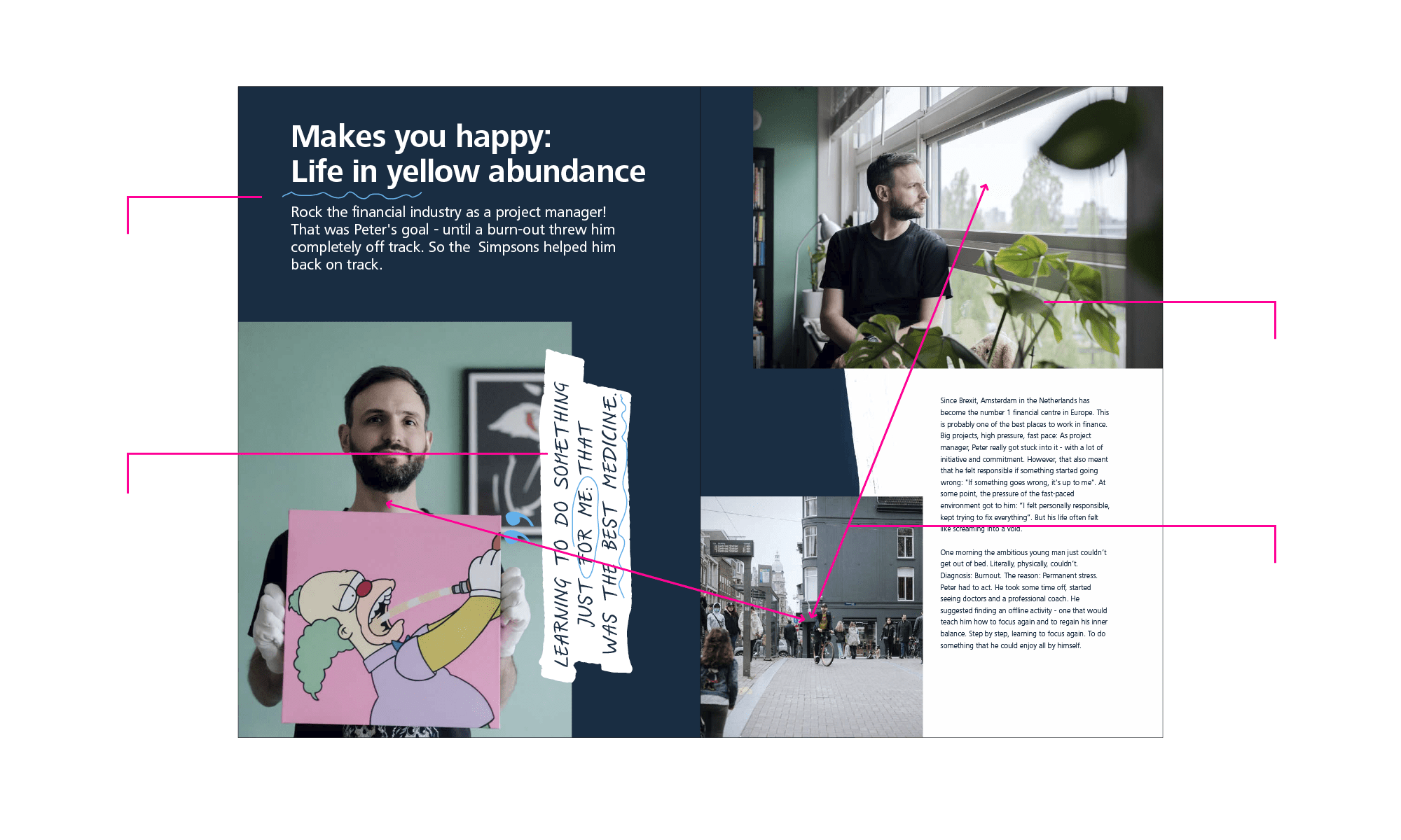
Tell a story
Storytelling also plays a decisive role in the Makers Line. The focus is on different makers who convey an authentic image of the brand.
Chapter Divider
In multi-page publications it may be useful to separate product groups from each other. Large-format application images and atmospheric texts inspire and encourage to implement your own DIY project.
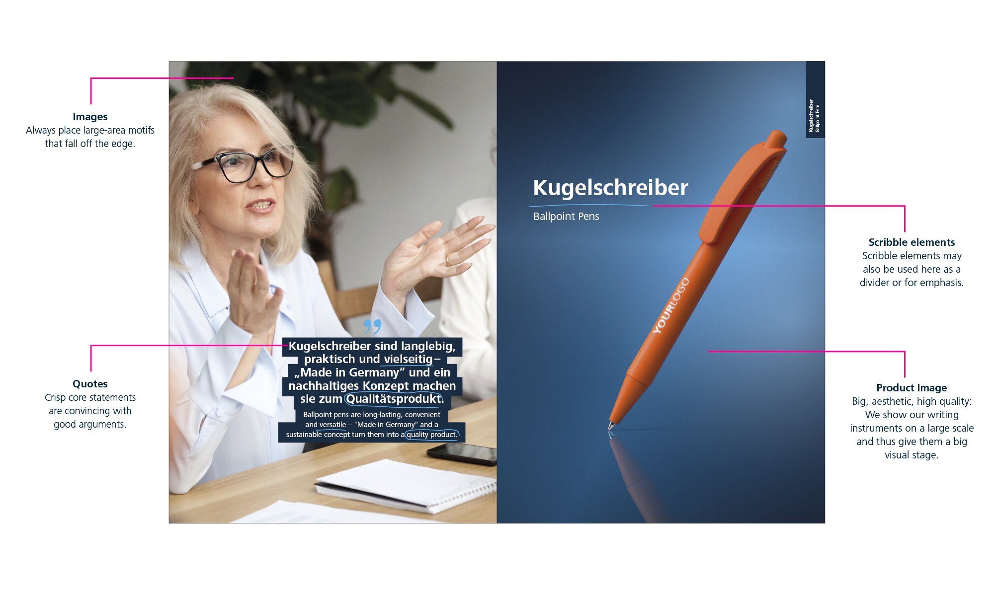
Promotional pens
Good comparability, clear layout, factual arguments: In the promotion segment, the focus is on the quality of our writing instruments.
Convincing right from the beginning: the cover
The cover is the most important page of a publication. Here you can see which elements help you to create an inviting title.
Present information
The clear listing of products plays an important role especially in the promotion sector. Readers need to be able to see at a glance what a writing instrument looks like. The high-quality presentation of the products is essential. Do you need a specific product presentation? Then please contact the specialist from the Marketing and Communication Department.
Chapter Divider
In the promotion area, we also introduce a product category with a short story. The focus here is on a suitable statement about the pen. The difference to “Write & Mark/Highlight”: The writing instrument is placed much more prominently here.
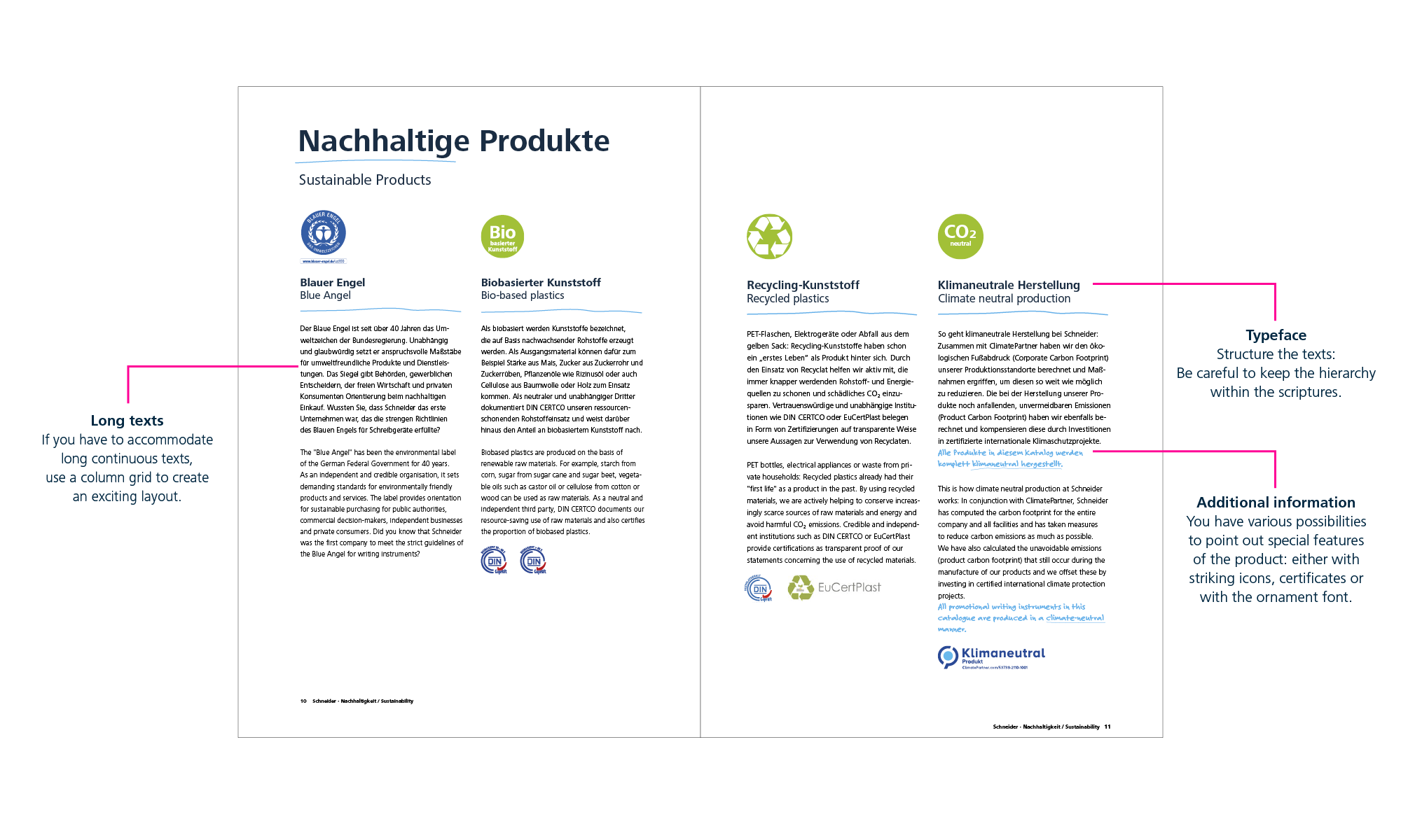
Design pages with a lot of texts
Long texts, no atmospheric photos, no product presentations – this can also be designed in an exciting way! It can look like this, for example:
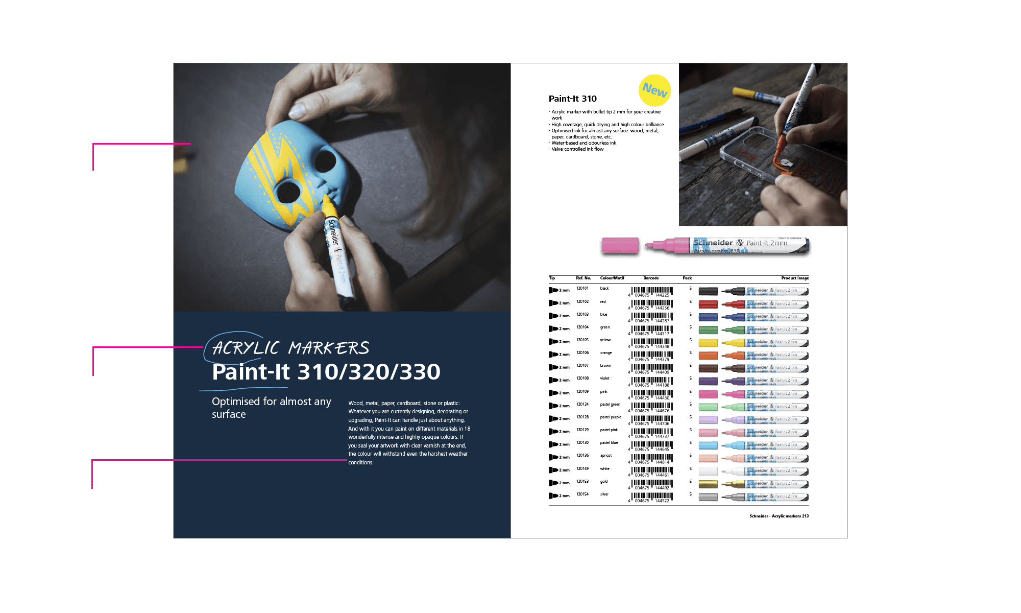
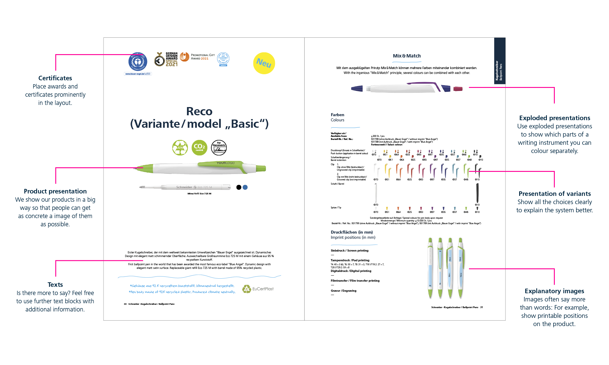
Present and explain products
Here it is particularly important to go into detail about the respective writing instrument: What does it look like exactly? Which parts can be inked and how? Which positions can be printed?
Downloads
We have prepared sample files as InDesign documents for you. They already contain all the important design elements and paragraph formats you need for your work.


